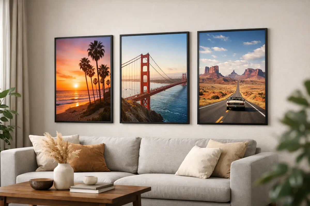
Choose the right California poster for the living room
A bright living room doesn't necessarily need more furniture. Often, a picture that opens up the view is enough. California posters for the living room achieve precisely this effect: sunny coastal roads, palm trees against a clear sky, the tranquility of the Pacific, or the graphic energy of Los Angeles. They depict a place that stands for ease, spaciousness, and a sophisticated, travel-inspired lifestyle.
The image itself isn't the only crucial factor. Format, placement, and framing are what truly transform a poster into a defining element of interior design. By carefully considering these three aspects to suit the room, you can give a blank wall a clear direction – without cluttering the living room.
Why California works so well in the living room
California is visually far more diverse than the classic palm tree motif suggests. The imagery ranges from the rugged coastline of Big Sur to elegant mid-century architecture in Palm Springs and urban perspectives from Los Angeles. This makes Californian motifs suitable for a wide variety of interiors: from bright, minimalist spaces to homes with warm wood, linen fabrics, and characterful vintage pieces.
The interplay of natural colors and clean lines is particularly compelling. Sand, cream, muted blue, sage green, and the deep black of a coastal road appear present but rarely loud. A California motif can therefore create atmosphere without dominating the existing color palette.
The desired mood also plays a role. Those who want to make their living room appear calmer and more spacious usually choose a wide coastal view, a horizon, or a scene with a lot of sky. For a more urban feel, buildings, pool areas, or street scenes are suitable. A high-contrast architectural motif appears more precise and modern, while an analog beach photograph seems softer and more personal.
Find the perfect California poster for your living room
The best starting point isn't which motif you currently like, but rather which wall needs a purpose. Above the sofa, wall art should usually provide support and visually unify the seating area. Opposite a window, it can create depth. In a reading nook, a smaller format can deliberately add a calming accent.
Coast and beach for bright, relaxed spaces
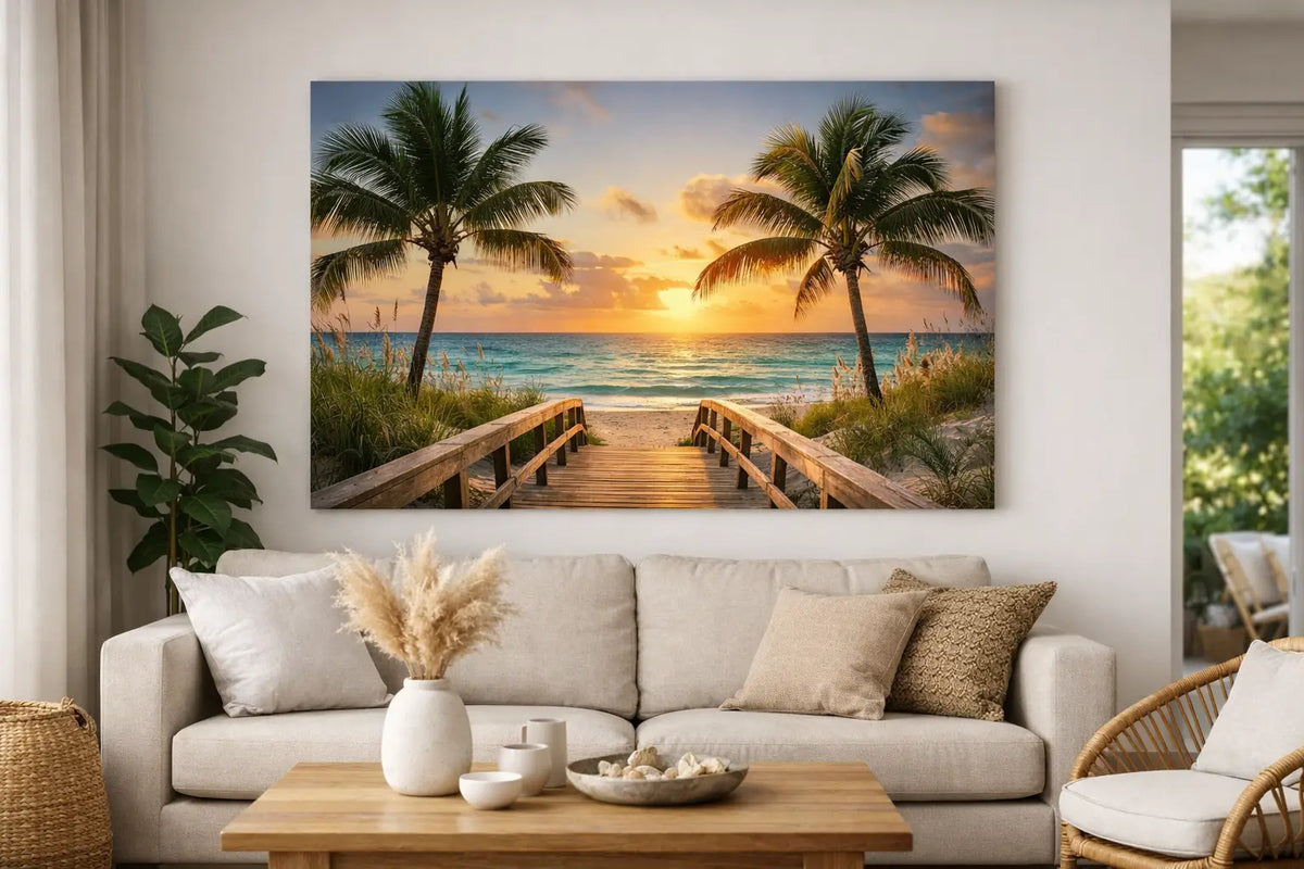
Coastal motifs are a good fit especially good in living spaces with natural materials. A picture of waves, rocks, or a quiet beach It complements bouclé, light wood, rattan, and linen without slipping into a nautical look. For a minimalist interior, choose a motif with subtle color gradients and plenty of negative space. The picture will then appear like an open window overlooking the Pacific.
In a large, already very bright room, the motif can have a bit more depth. A darker cliff, a deep blue sea, or a coastal road creates contrast and prevents the wall from visually disappearing.
Palm Springs for a clear design accent
Palm Springs evokes images of sunny architecture, pools, desert colors, and iconic shapes. These motifs are a great choice if your living room has a modern, minimalist, or mid-century design aesthetic. Graphic facades, flat roofs, and geometric shadows add texture to the walls.
It's all about the right balance. A single large-format architectural image can confidently define a room. Several similarly striking images in the same area, however, can quickly appear decorative rather than curated. If you want to create a gallery wall, it's best to combine a Palm Springs image with calmer abstract prints or a smaller close-up.
Los Angeles for urban excitement
Los Angeles provides the perfect visual backdrop for living spaces intended to have a more edgy and cosmopolitan feel. Street scenes, modern facades, neon details, or views across the city create an urban counterpoint to soft textiles and organic furniture. This works particularly well in older apartments, lofts, and cleanly furnished new builds.
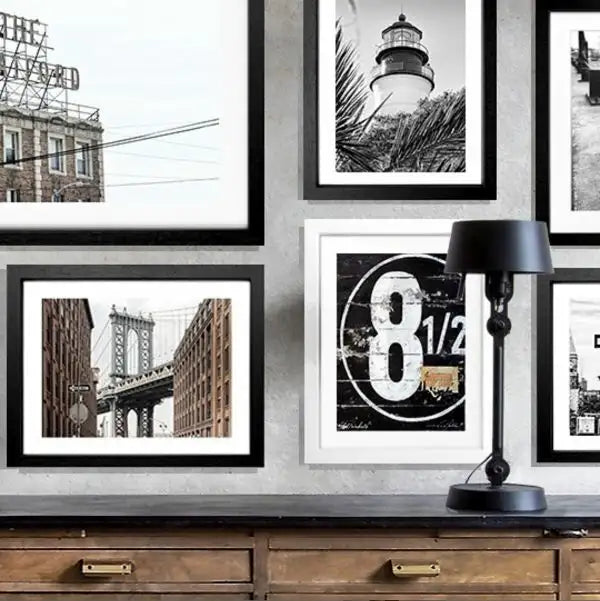
Pay attention to the visual language here. A vibrant cityscape immediately draws attention and requires sufficient free space. If the wall is already dominated by shelves, lamps, or striking furniture, a calmer black-and-white photograph might be the more elegant choice.
Size and placement: Impact from centimeters
A picture that's too small above a wide sofa is one of the most common reasons why wall decor looks unfinished. As a guideline, a single framed picture should occupy about two-thirds of the width of the furniture below it. So, on a 240-centimeter-wide sofa, a generous horizontal format works much better than a small poster centered above the seat.
For high ceilings, vertical formats or two coordinated works stacked one above the other are particularly interesting. They draw the eye upwards and utilize the room's architecture. Above a sideboard, chest of drawers, or low bench, horizontal formats usually appear calmer because they echo the horizontal lines of the furniture.
Don't hang the picture too high. In living areas, the center of the image is often comfortably positioned at about 145 to 155 centimeters from the floor. Above a sofa or sideboard, the distance to the piece of furniture is more important than this rule of thumb: A gap of around 15 to 25 centimeters creates a visible connection without the frame and furniture competing with each other.
If you're unsure, mark out the desired size on the wall beforehand with painter's tape. Even from a few meters away, you'll see whether a motif has enough presence. This simple test prevents you from choosing a high-quality framed picture that's too small later on.
The frame determines the final impression.
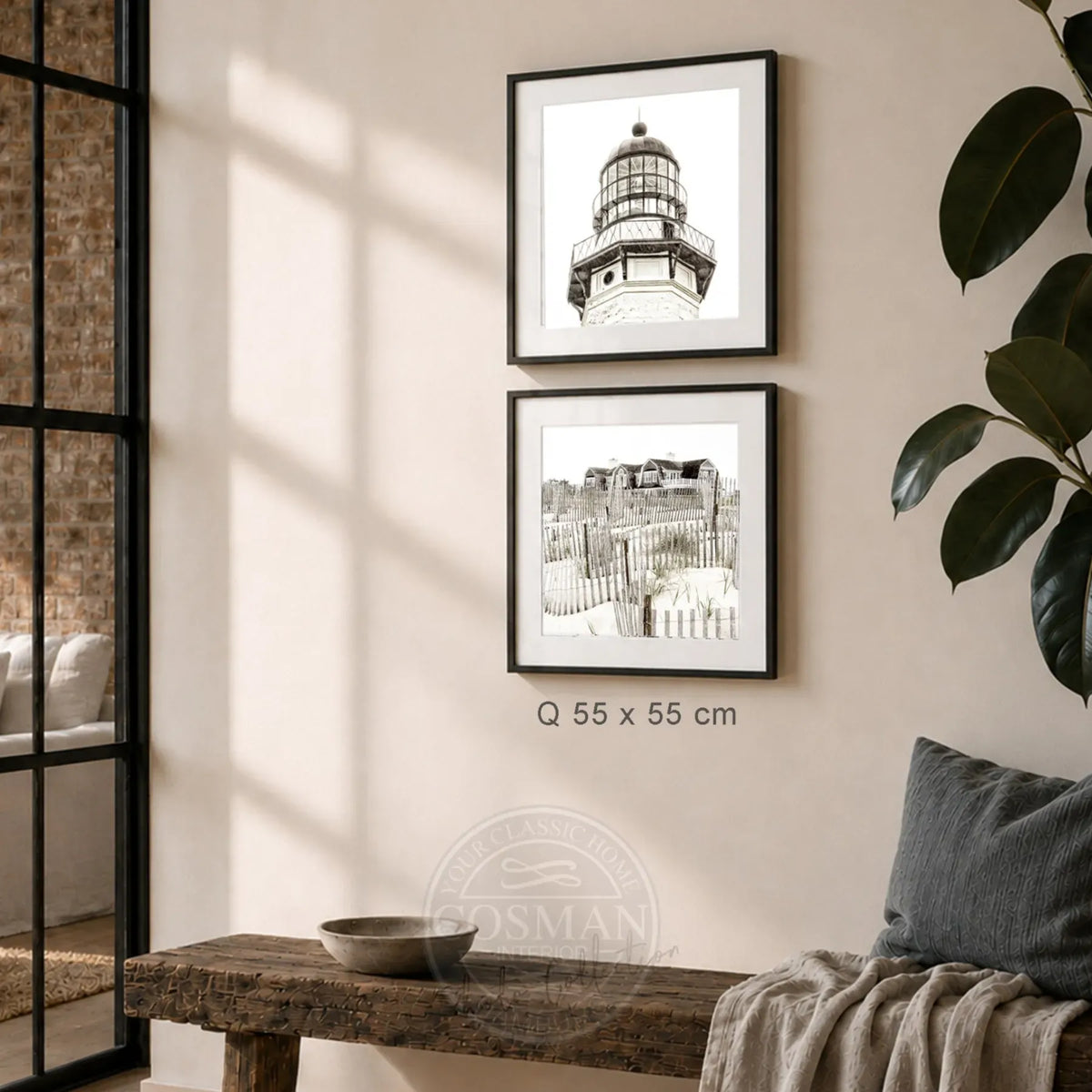
A Californian scene gains significantly in impact with the right frame. Black frames give architecture, street scenes, and high-contrast photographs a precise, contemporary edge. They complement black lamps, dark accents, or a modern kitchen in an open-plan living area.
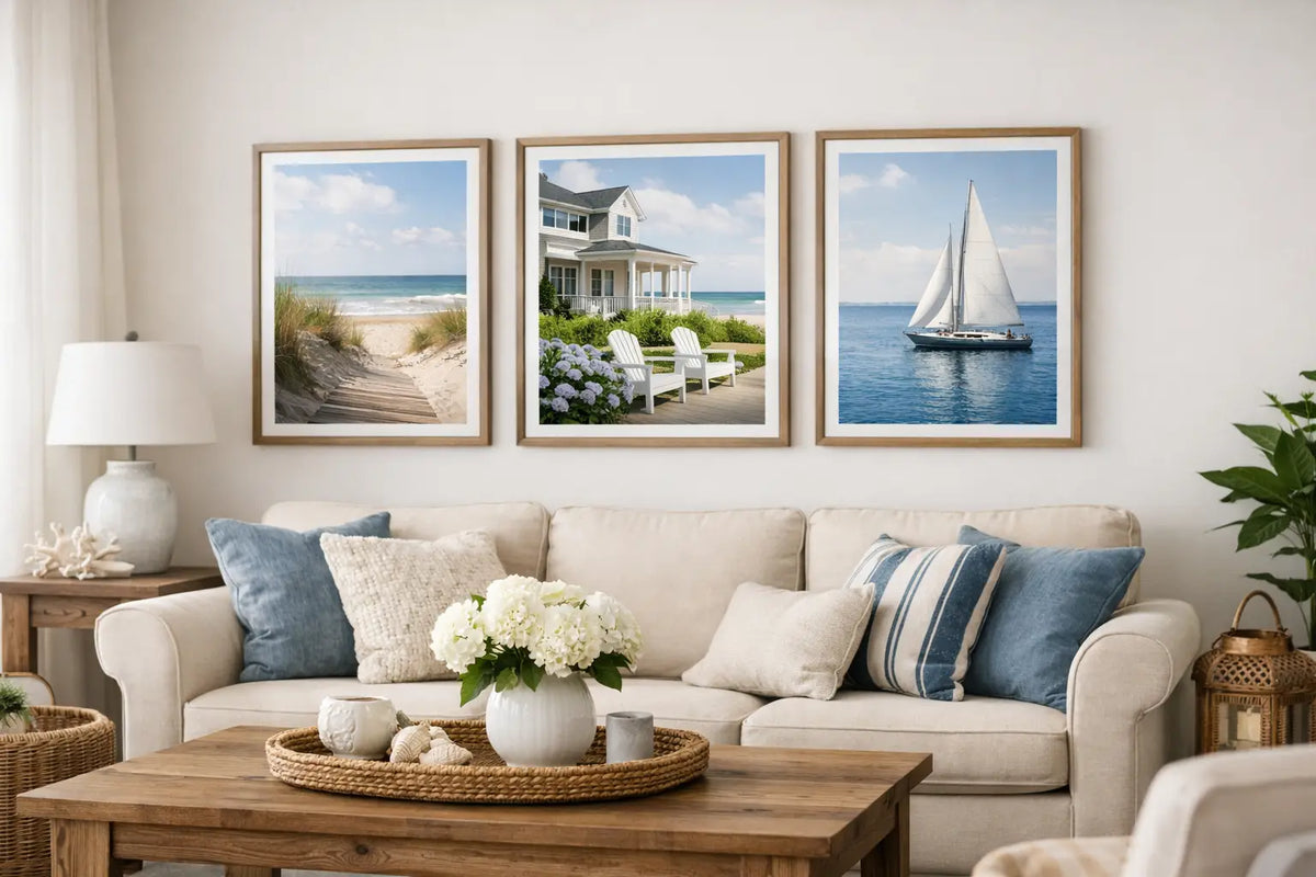
Natural wood and light wood frames create a warmer feel. They accentuate beach motifs, soft desert colors, and photographic scenes with an analog feel. In a living room with oak, travertine, or beige textiles, this creates a harmonious overall look, without everything having to look exactly the same.
White frames are a good choice when the image is meant to appear light and almost floating. On white walls, they blend more seamlessly with their surroundings, allowing the color and photography to truly shine. A wide white border can also create a sense of calm, especially with highly detailed images.
The difference between a loose print and a ready-to-hang framed picture The difference is noticeable in everyday life. High-quality photo paper, a meticulously handcrafted frame, acrylic glass, and a suitable hanging system ensure that the artwork can be displayed immediately after unpacking. At Cosman Photocollection, printing, framing, and hanging are conceived as a complete unit – especially practical when furnishing multiple rooms or a vacation home.
Pick up the colors from the motif in the room
A picture doesn't have to repeat every color in the living room. Two small covers are usually enough. If a cushion picks up the ochre of a desert landscape or a vase captures the blue of the ocean, the arrangement appears deliberately curated. The rest of the furnishings can remain neutral.
When choosing a colorful California poster, restraint around the image is often the better option. Leave some space between the poster and shelves, plants, or wall lamps. An image with a clear line of sight appears more sophisticated than one that has to compete for attention among many small objects.
Black and white photos offer more freedom with accessories, but can appear cold if the room consists exclusively of gray, white, and black. Wood, a warm rug, or cream-colored textiles give them the necessary coziness. Conversely, sunny, colorful motifs work very well with darker accents such as walnut, black, or cognac.
Single picture or gallery wall.
A large-format single image is the right choice when the wall is meant to take center stage. It creates a calm, spacious feel and is ideal above a sofa, dining table, or sideboard. Panoramas, coastlines, and architectural photographs especially benefit from this presentation.
A gallery wall adds personality but requires a clear unifying element. This could be a common frame, a similar color palette, or a travel theme. Don't mix different styles haphazardly. A combination of Californian coastline, Palm Springs, and an abstract work in sandy tones can look very harmonious, as long as the formats and spacing are carefully chosen.
For an elegant result, the spacing between the frames should remain consistent. Five to eight centimeters usually looks calm and balanced. Lay the arrangement out on the floor or photograph it before hanging the first frame.
A California image doesn't need to explain why you're fascinated by the place. It can simply bring light, distance, and a certain sense of freedom into the room every day. Therefore, don't choose the most striking picture, but rather the one that you'll still enjoy looking at weeks later.