Article: Choose the best motifs for your dining room
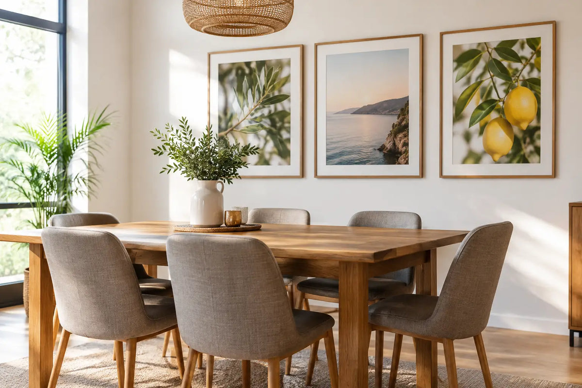
Choose the best motifs for your dining room
A dining room doesn't become a favorite place just because of the table. It is often the wall behind it that decides whether the room appears cool and unfinished or whether it welcomes guests, carries conversations and exudes a special sense of calm in everyday life. The best motifs for dining rooms create exactly this effect: They give the room an eye-catcher without taking away its lightness.
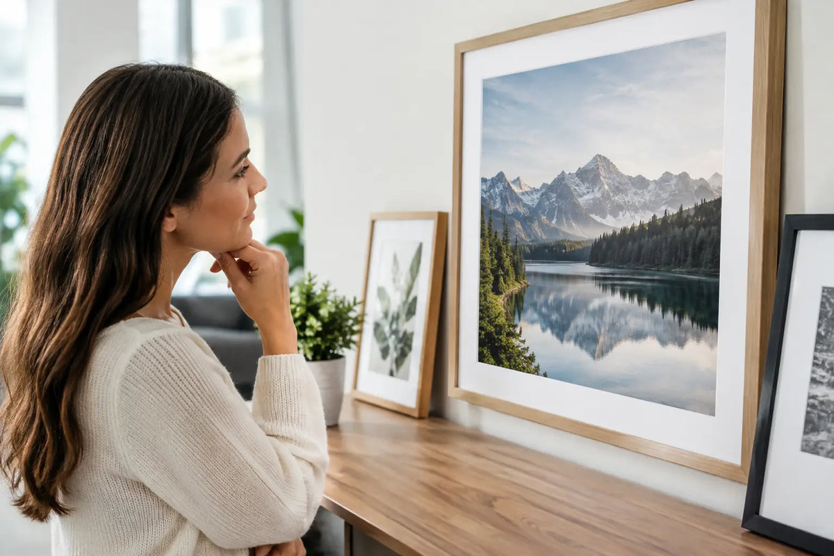
It's not about decorating every free area. A large, carefully framed picture can have more presence than several small posters. The decisive factors are the mood of the motif, the proportions to the wall and a framing that naturally fits into your interior.
Which motifs fit into the dining room?
The dining room is a social space. This is where people eat, work, celebrate and sometimes sit until late into the night. Wall art can therefore show character, but should remain pleasant in the long term. Motifs with a clear visual language usually work better than very small or busy representations.
Travel photographs, Coastal views, urban architecture and abstract compositions are particularly harmonious. They open up conversations without being too bold. However, the right choice always depends on whether your dining room is rather bright and reduced, classically furnished or characterized by warm natural materials.
Coastal motifs for lightness and space
Photographs of Sylt, Saint-Tropez, the Hamptons, Florida or California bring a relaxed, elegant atmosphere to the dining table. A wide beach, dunes, a calm horizon or the graphic lines of a beach club make small rooms appear more spacious. Such motifs look particularly harmonious in dining rooms with light wood, linen, natural stone or woven details.
The advantage of coastal pictures lies in their timeless color world. Sand, blue, white and muted green tones can be easily combined with dishes, vases and textiles. If the room already has many warm beige and brown tones, a motif with a clear sky or deep blue water can provide a pleasant contrast.
Quiet, almost minimalist beach scenes are suitable for a reserved interior. If you like it more sophisticated, opt for motifs with parasols, yachts or iconic Riviera architecture. Both convey a summer feeling, but the effect is different: one appears relaxed, the other more lively and glamorous.
City motifs with an architectural presence
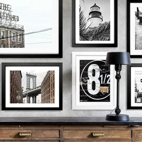
City images give the dining room a modern, cosmopolitan touch. Hamburg goes perfectly with Nordic, clear interiors, while New York impresses with its dynamism in loft atmospheres or contemporary spaces. It is crucial that architecture in the image does not compete with other strong lines in the room.
A horizontal city motif often works particularly well above a rectangular dining table. It takes up the width of the table and creates a calm connection between the furniture and the wall. With high ceilings, however, a portrait format with a striking facade, staircase or skyline can emphasize the verticality of the room.
Black and white city photography looks classic and precise. Colored photos, on the other hand, bring more warmth and personality. An evening light in Hamburg, the pastel-colored facades of Miami or the clear geometry of Californian architecture can become the actual color accent of the room.
Abstract art for an individual frame
Abstract motifs are ideal if you don't want to focus on a specific location, but rather a specific mood. Flowing shapes, graphic surfaces or subtle color gradients can structure a dining room without prescribing a specific story. This is particularly valuable in open living and dining areas: the picture elegantly connects different functional zones.
Choose the colors not only to match the wall, but also to match the dominant materials. Abstract motifs with cream, sand, black or warm rust nuances go well with a table made of dark wood or marble. In a bright, modern environment, cool blue, sage green or a bold accent tone can make the room more striking.
Abstraction can be visible, but it doesn't have to be loud. An image with two to three recurring colors usually appears more harmonious in the long term than a very colorful motif. This is especially true if there are regularly flowers, candles or colored dishes on the table.
Select the best motifs for the dining room based on the effect of the room
Before you decide on a motif, it is worth taking a look at the desired effect. If you want the dining room to appear more open, choose perspectives with depth: a long jetty, a coastline, a street or a wide view over water. Warm colors, more detailed architectural scenes or abstract pictures with soft shapes are suitable for more security.
In a small dining area, a single large-format work is often the better decision. Too many small pictures can visually fragment the wall. A generous motif, on the other hand, creates a clear focal point and makes the area appear more deliberately designed. As a guide, the picture can take up about two thirds of the width of the table, as long as it is aligned centrally with the seating area.
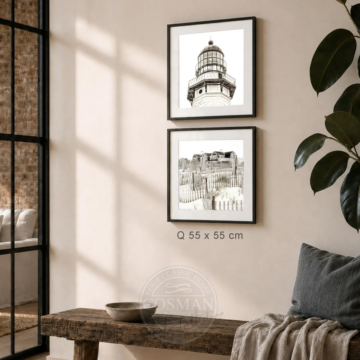
If there is a long, free wall, a row of pictures can make sense. Two or three photographs that go together, such as different coastal perspectives or architectural details of a city, create rhythm. What is important is a uniform frame and even spacing. Different formats can be attractive, but require consciously planned hanging.
Frame, format and placement are decisive
A high-quality print clearly benefits from the right frame. A narrow black frame precisely highlights graphic city motifs and high-contrast photography. Oak brings warmth to rooms with natural materials. White can appear very calm on light walls, while dark or metallic frames add more depth.
Acrylic glass provides a clear, high-quality presentation and protects the image surface. This is particularly practical in the dining room, where steam, small splashes and a lively everyday life are created. At the same time, the picture should not hang directly above a very steamy stove if the kitchen and dining area are openly connected.
The height also makes a noticeable difference. As a basic rule, the center of the image is approximately at eye level when standing. The work can hang a little lower over a sideboard so that the furniture and art appear as a unit. Behind the dining table, the line of sight of the people sitting is relevant: pictures placed too high quickly lose their proximity and look as if they are floating on the wall.
At Cosman Photocollection, photo prints are made on high-quality paper, framed by hand and supplied with hanging equipment. This saves you the hassle of searching for the right frame and mounting material, especially for larger formats. You will receive a work of art that is ready to hang and is intended as a design element - not as a poster that has to be completed somehow later.
So your selection remains consistent in the long term
A dining room picture should not only match the current table decor. Instead, ask yourself whether you still like to see the motif even if the vase, chairs or wall color change. Places, architecture and abstract color worlds with clear compositions have an advantage here: they remain present without quickly wearing out.
Avoid motifs that impose a mood that does not fit your everyday life. A dramatic nighttime panorama can look great, but it needs a space that can accommodate its intensity. In a sunny family dining room, a bright coastal look or a warm, graphic abstract may be a more appropriate choice.
At the end, take a moment in front of the free wall. Imagine how the image looks in breakfast light, at dinner with guests and on a quiet Sunday. The best motif is not necessarily the most eye-catching - but rather the one that gives your dining room the atmosphere that makes you want to sit for longer every day.