Choose the right wall pictures for narrow hallways
A narrow hallway decides in just a few steps how a home looks: inviting and personal or merely functional. If you want to choose murals for narrow hallways, you shouldn't just fill a free wall. Proportion, direction of view, motif and framing are crucial. With the right selection, a passageway becomes a deliberately designed introduction to the living space.
Select wall pictures for narrow hallways: The format dictates the direction
In the hallway it is usually not space on the wall that is missing, but rather depth in the room. Large-format images can be very effective here, as long as they respect the relationship between wall width, ceiling height and walkway. A motif that takes up almost the entire width of the wall quickly makes an already narrow area appear crowded. Images that are too small, on the other hand, become lost and appear to be randomly placed.
As a guide, a single mural may take up approximately two-thirds of the available wall width. With a free wall of 120 centimeters, a format between 70 and 90 centimeters wide often appears balanced. If space remains visible on the side, the image has more presence and the hallway has more peace.
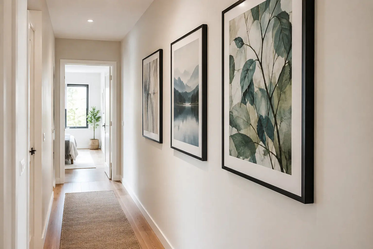
Portrait formats are particularly suitable for long, narrow hallways. They take up the vertical line of the room and direct the eye upwards instead of emphasizing the narrowness horizontally. A generous portrait format next to the cloakroom or at the end of the hallway sets a clear focus. Landscape formats, on the other hand, fit short sections of wall, such as a narrow console or bench. There they create visual width without weighing down the passage.
One big picture or several small ones?
A single, carefully framed picture is often a stronger solution. It creates a calm, high-quality effect and does not require any additional attention in the small space. Especially in modern apartments or old buildings with clear wall surfaces, a large photo motif can immediately define the hallway.
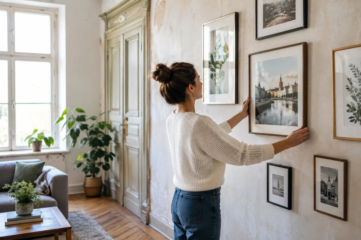
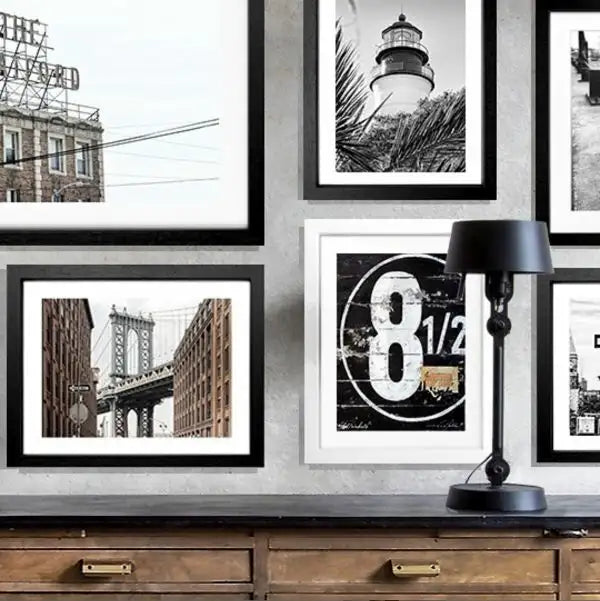
Multiple images work if the hallway is long enough and the arrangement remains consistent. A series of frames of the same size at the same height creates rhythm. However, different formats, changing frame colors and uneven spacing can quickly appear restless in narrow areas. Who planning a picture wall, should treat it like a coherent composition - with a recurring frame, coordinated motifs and sufficient space between the works.
Motifs that give width to a narrow hallway
A mural not only changes the mood, but also the perceived depth of a room. Motifs with perspective are therefore particularly suitable for narrow hallways: a jetty leading to the water, a coastal road, a wide skyline or a beach with an open horizon. They create a point of view that goes beyond the actual boundaries of the room.
Travel photography also brings personality into the entrance area. A Hamburg harbor scene conveys an urban flair, while Sylt, California or the Hamptons create a relaxed, light-flooded atmosphere. For a home with a more classic feel, architectural shots from New York or Saint-Tropez can create the right balance of elegance and wanderlust. It's not just the travel destination that's important, but rather its imagery: clear lines, air in the motif and a harmonious world of colors have the greatest effect in the hallway.
Abstract wall art is a good alternative if the room already offers a lot of information through doors, shoes, jackets or a distinctive lamp. Generous shapes, subtle contrasts and bright surfaces make the hallway appear more orderly. Very small-scale motifs, very dark imagery or many competing colors can appear deliberately dramatic, but require more space. In a windowless, narrow hallway they usually only make sense if the lighting and furnishings are deliberately kept to a minimum.
Light tones or dark accents?
Bright motifs with sand, sky, water, white and warm natural tones reflect existing light and support an open effect. They are particularly suitable for narrow hallways without daylight. However, an image does not have to be pale to appear light. Deep blue tones, a dark horizon or a high-contrast black and white photo can give the entrance area character if the wall color and floor offer enough calm.
It's all about balance. In front of a white or warm gray wall, a darker picture can become an elegant eye-catcher. If the walls are dark or there is little lighting, we recommend bright photographs, generous mounts or frames in light wood and white tones. This means the image remains present without visually closing the room.
The frame is part of the spatial effect
In the narrow hallway, a frame is viewed from a short distance. Material, color and depth are therefore more noticeable than in a spacious living room. A high-quality, cleanly crafted frame gives the motif support and ensures that it does not look like a loose poster. This processing makes a noticeable difference, especially in the entrance area that residents and guests pass through every day.
Black frames create clear, modern contours and suit urban photography, graphic motifs or furnishings with black details. White frames appear light and reserved, especially on colored walls or with bright coastal motifs. Natural wood brings warmth to hallways with stone floors, neutral wall colors and natural textiles. Gold-colored or more heavily profiled frames can add elegance to a classic old building, but should be used specifically and not repeatedly in a very narrow hallway.
Also Acrylic glass is a thoughtful choice in the hallway. It protects the image when it is passed by frequently and at the same time maintains a high-quality, clear appearance. In large formats it is also lighter than classic glass - a practical advantage during installation.
The right height creates peace
Many murals hang too high in the hallway. As a rule of thumb, the center of the image is approximately at eye level, often between 145 and 155 centimeters from the ground. In the entrance area, this value can vary slightly, for example if a console, a bench or a high skirting board characterizes the lower wall area. It is important that the center of the motif is not aligned with the height of the door or switches, but rather with the perspective of a person walking.
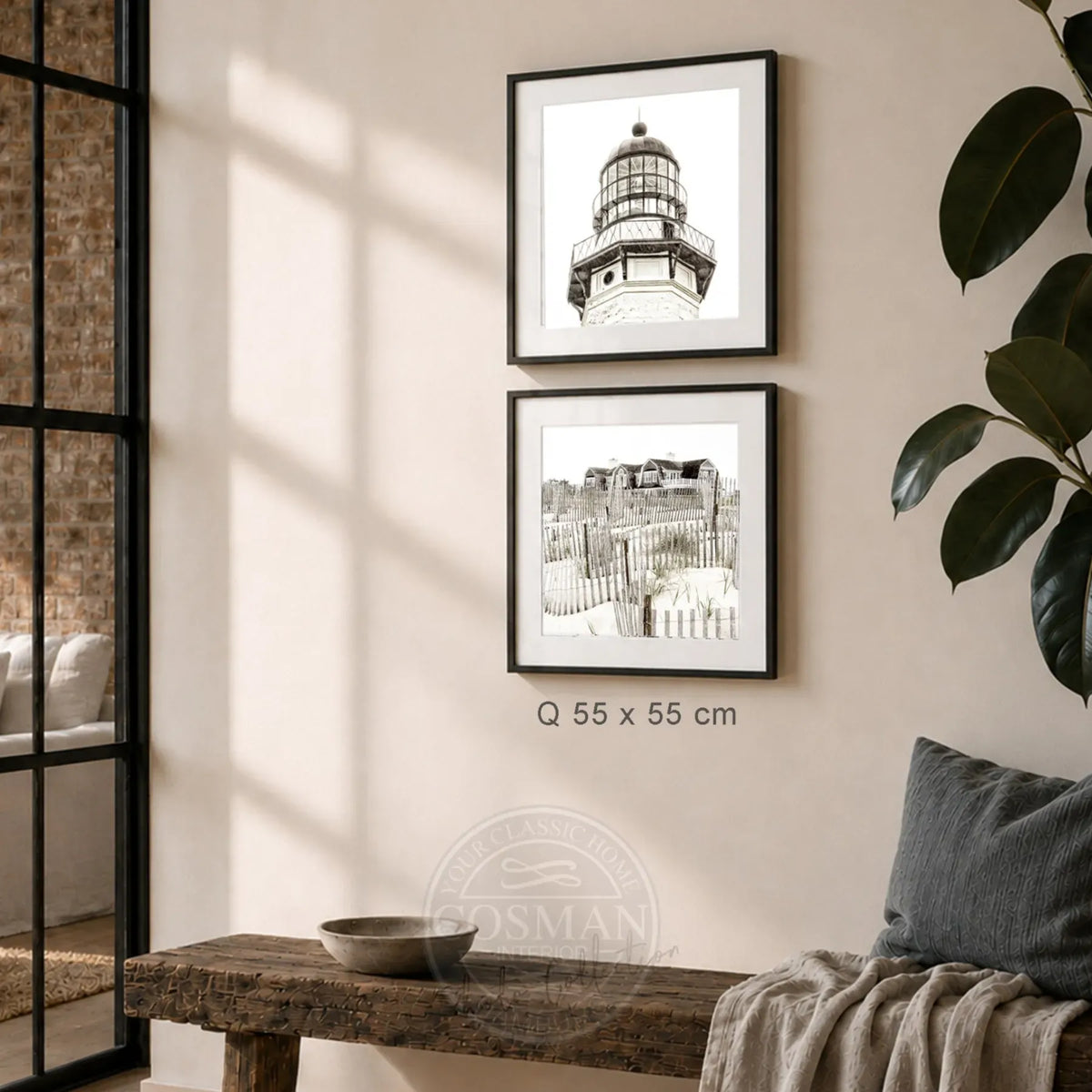
If a picture is hanging over a piece of furniture, there should usually be a distance of around 15 to 25 centimeters between the edge of the furniture and the bottom edge of the frame. This combines both elements into one unit. On a long, free wall, a single picture can be placed a little more generously. It then deliberately needs air around itself so that the wall does not appear small.
Before hanging, check the view from both directions. In a hallway, a picture is rarely viewed head-on and for a long time. It has to be convincing when you enter, remain coherent when you walk past and still have a clear impact from the adjacent room.
Practical details that make the selection easier
Not only measure the wall, but also the narrow spot in the walkway. A very deep frame may be impractical next to an open door, wardrobe or shoe cabinet. Also consider light switches, intercom and door frames. A beautiful motif wins when it doesn't have to be planned around technical details.
For rented apartments, it is worth marking the desired position in advance with painter's tape the size of the picture. This makes it clear whether the format confidently fills the wall or restricts the area. If you want to save yourself the hassle of coordinating print, frame and mounting, you will benefit from wall art that is framed ready to hang. At Cosman Photocollection, high-quality photo prints are framed by hand and delivered with hanging - a clear solution if you want to finish the hallway without additional errands.
The hallway doesn't have to tell all the stories of a home at once. A single image with a strong perspective, harmonious size and appropriate frame is often enough to turn the daily passageway into a place with atmosphere.