
Which frame width looks high-quality in the room?
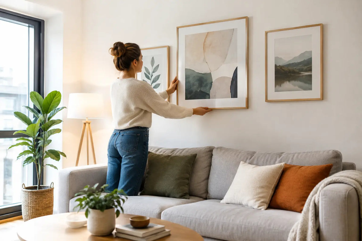
A carefully selected motif can lose its impact if the frame is too narrow, too dominant or not tailored to the format. Which frame width looks high-quality, is therefore not decided by a fixed number of centimeters, but rather by the interaction of image size, motif, wall and furnishings. The right frame gives a print presence without pushing itself into the foreground. This is exactly the difference between a decorated wall and a room that appears visibly well thought out.
Which frame width looks high-quality?
As an elegant guideline, the larger the picture, the more width the frame can have. For small to medium formats, a slim frame strip of around 1.5 to 2.5 centimeters usually has a high-quality and precise appearance. It gives photographs, abstract motifs or graphic prints a clear outline without visually weighing down the image.
For larger murals with an edge length of around 70 centimeters or more, a width of 2.5 to 4 centimeters can be clearly more effective. Large formats need a frame that visually supports their surface. A bar that is too fine can quickly appear lost in a spacious New York panorama, a wide beach shot from Sylt or an expressive abstract motif.
Even wider frames can look very elegant if they are used consciously. They create a gallery-like effect in spacious living rooms, old buildings with high ceilings or representative entrance areas. However, in a small room, the same width can seem heavy. High quality does not automatically mean as wide as possible, but rather convincingly proportioned.
The proportion between the image and the frame
The frame is not just an accessory. It expands the image outwards and determines how much calm, contrast and presence a motif receives on the wall. Balance is crucial, especially with a framed photograph: the motif should attract the eye, and the frame should give it a confident finish.
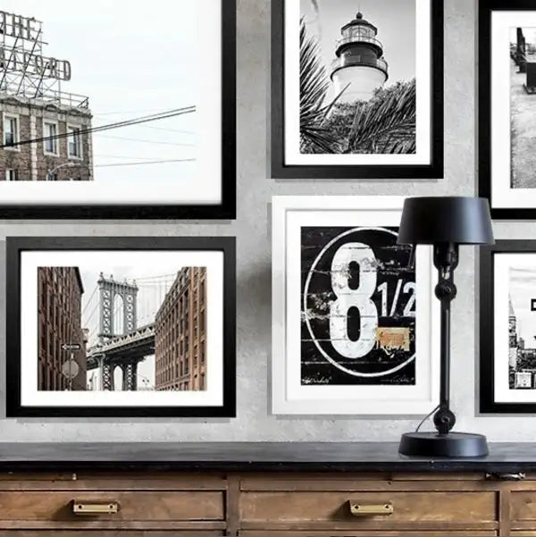
A narrow frame looks modern, reserved and clear. It goes particularly well with minimalist interiors, fine black and white photos and subjects with lots of air, sky or architecture. A black, slim frame can emphasize the graphic depth of a Hamburg city scene, while a white frame makes bright coastal motifs appear light and fresh.
A medium-wide frame conveys more value and is suitable for many living styles. It brings structure to the wall without appearing classic or massive. This width is often the best choice for living and dining areas where you want the image to play a visible role but not dominate the entire room.
Wide frames make a stronger design statement. They go well with large-format pictures, striking color schemes and walls that are deliberately presented as eye-catchers. A deep blue ocean, warm California tones or a high-contrast architectural motif gain charisma through a more powerful frame. Provided the environment leaves enough space for the image.
A simple rule of thumb for selection
Don't just consider the print format, but always the external dimensions of the finished framed picture. A frame of three centimeters visibly takes up space on each side and changes the overall effect more than it initially seems. With a small subject, a wide frame can quickly give the impression that the frame is more important than the image.
With large-format wall art, the situation is reversed. Here a slightly wider bar creates stability and a clear finish. If you are unsure, choose a narrow to medium width for a small format and a medium to slightly thicker bar for a large format.
Passepartout: More peace without a wider frame
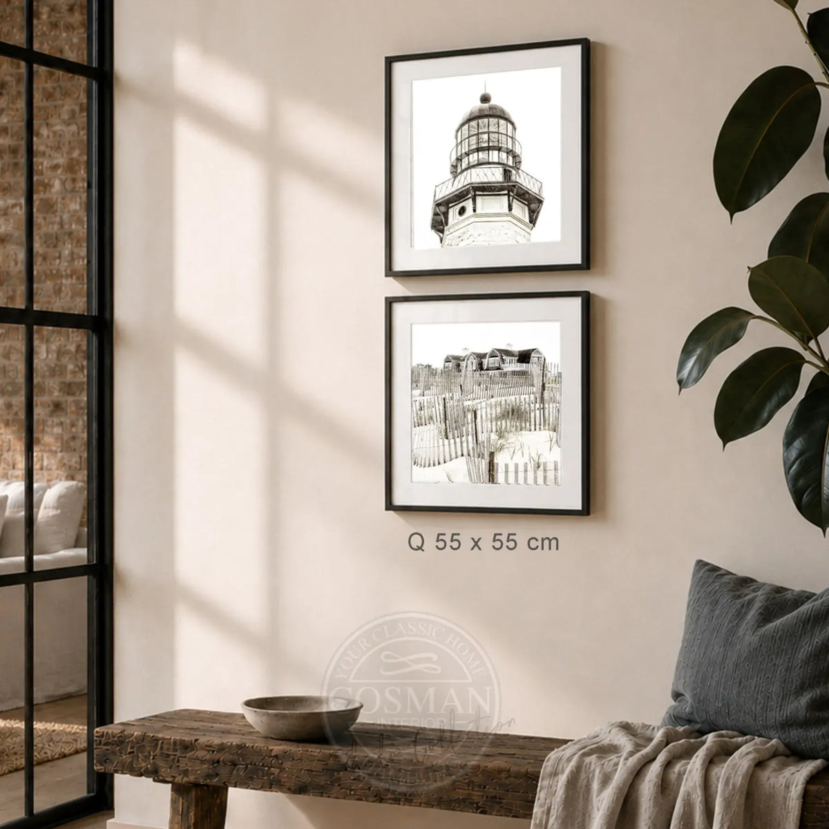
Not every high-quality framing needs a wide bar. A passe-partout can add generous calm to a picture without making the frame itself stronger. The free edge between the motif and the frame draws the eye to the picture and at the same time makes it appear more artistic, lighter and more individual.
Photographs in particular benefit from this. A travel photo from Saint-Tropez, an atmospheric Hamptons motif or a finely composed cityscape gain more depth with a passe-partout. The motif does not appear restricted, but rather consciously presented. Especially with smaller pictures, this solution can appear to be of higher quality than a very wide frame.
The relationship is important: A narrow passe-partout looks discreet, a generous edge gives the picture more of a gallery feel. For quiet, elegant rooms, a wider passe-partout may be the right choice. For lively, color-intensive motifs, a reserved border is often enough so that the image and frame do not compete for attention.
Frame color and material change the perceived width
Two frames of identical width can appear completely different. A black frame stands out more against a light wall and therefore appears more present. It gives urban motifs, black and white photographs and modern interiors a clear outline. Black ensures a precise, high-quality effect, especially on narrower strips.
White frames visually recede and make rooms appear brighter and more open. They are particularly suitable for light walls, Scandinavian-inspired interiors and breezy beach or coastal motifs. Since the contrast is lower, a white frame can be slightly wider depending on the color of the wall without appearing dominant.
Natural wood brings warmth and structure to the design. Its effect depends heavily on the color and grain. Light woods go well with natural materials such as linen, oak and ceramic. Darker wooden frames appear more classic and add an elegant accent to spacious rooms. When it comes to wood, a cleanly finished surface is particularly important because it turns a mere strip into a visible part of the furnishings.
The frame profile also plays a role. A flat, straight profile appears contemporary and reduced. A deeper profile can give a mural more spatial presence. Acrylic glass complements this effect with a clear, modern surface and at the same time protects the print in everyday life.
Correctly include room size and wall space
Quality framing does not work in isolation. It must match the wall it is hanging on. The image format can be generous over a wide sofa, sideboard or dining table. The frame can be chosen to be thicker because the furniture and wall space provide enough visual counterweight.
On a narrow wall in the hallway or between two windows, restraint is often more convincing. A fine frame keeps the arrangement light and prevents the area from appearing overloaded. If multiple images are hanging as a series, the frame widths should be consistent. Different motifs can come together if their framing creates a common line.
The distance between several images also influences the value. If the works are hung too close, even high-quality frames appear unsettled. A little space between the formats allows each motif to work on its own and makes the group as a whole clearer. At a picture wall The same frame colors and profiles are usually more important than identical image sizes.
Typical wrong decisions when it comes to frame width
The most common wrong decision is a frame that is too narrow in a large format. The picture then looks as if it lacks the final, professional frame. A very wide, conspicuous frame around a small motif without a passe-partout is equally unfavorable. It can visually suppress the image instead of enhancing it.
The color of the walls is also often underestimated. A light frame on a white wall needs enough contrast through the profile, shadow gap or passe-partout so that it does not disappear. A black, wide frame on a dark wall can appear very reserved, while it makes a strong statement on light plaster.
Finally, the frame width should match the use of the room. In the bedroom, motifs can often appear calmer, finer and lighter. Wall art can develop more presence in the living room, in a holiday property or in the reception area. A high-quality solution is always one that reflects the character of the place.
A high-quality effect begins with a finished overall picture
The most beautiful frame idea loses value if the print, glass, assembly and workmanship do not match. A cleanly printed motif on high-quality photo paper, a hand-made frame, acrylic glass and a ready-to-hang delivery combine to create the calm quality that you immediately notice on the wall. At Cosman Photocollection it is precisely this interaction that is thought of with curated motifs and individually framed wall art.
If you are torn between two frame widths, do not choose the more noticeable solution, but rather the more harmonious solution. The right amount doesn't make your image louder - it makes it appear natural in its place.