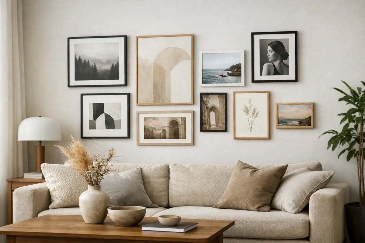
Design a picture wall correctly for stylish rooms
An empty wall rarely just looks empty. In the living room, it might lack warmth, in the hallway, orientation, in the bedroom, personality. A gallery wall can transform exactly this space—provided the selection appears curated rather than random. How to properly design a gallery wall Those who want to do this don't need complicated art theory. What's crucial is a clear concept, appropriate proportions, and high-quality images that work together as a whole.
A successful mural doesn't necessarily tell a story in the literal sense. It can convey a longing for a place, for example, through... Motifs from Hamburg, Sylt or New York. She can calm a room with abstract forms. Or she can create a precise accent with a single large-format painting. The difference lies in the planning before the first nail is driven.
Read the room description first, then select images.
Before comparing images, consider the wall and its surroundings. A gallery wall above a sofa needs a different effect than one along a staircase or in a narrow entryway. Furniture, lighting, and wall color also determine what looks harmonious. An airy, bright room often supports larger formats and strong contrasts. In a room with many materials, colors, and furniture, on the other hand, calm photographs or a reduced color palette will create balance more quickly.
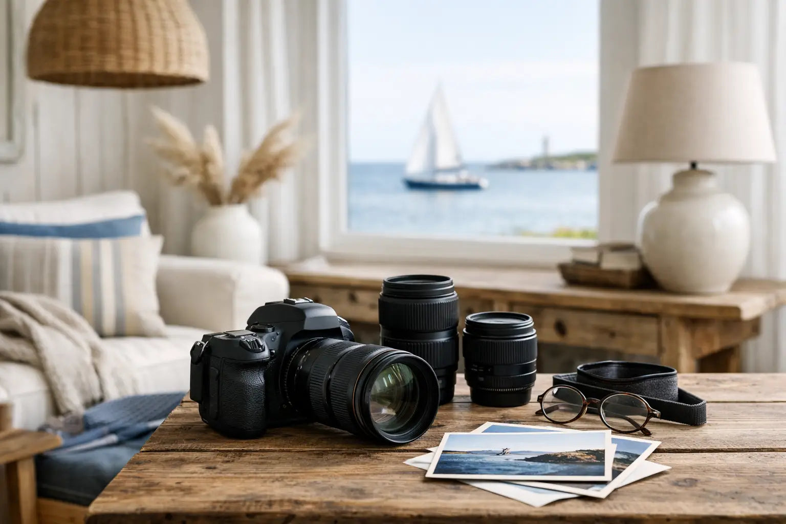
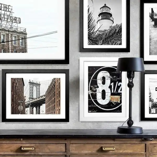
Therefore, don't just ask yourself which pictures you like individually. More importantly: What atmosphere do you want the room to convey? Coastal scenes in blue, sand, and white bring a relaxed, elegant touch to a dining area. Architectural photographs of metropolises appear graphic and urban, especially when paired with modern furniture. Abstract art can incorporate colors from carpets, cushions, or curtains without overwhelming the room.
Next, establish a framework for your selection. A gallery wall is particularly compelling when there's at least one unifying element: a color palette, a travel theme, a similar visual style, or a consistent frame. This doesn't mean that every image has to look the same. A mix of a tranquil beach scene, a striking cityscape, and an abstract detail can be particularly interesting, as long as the overall effect remains cohesive.
Designing a gallery wall correctly: Finding the right layout
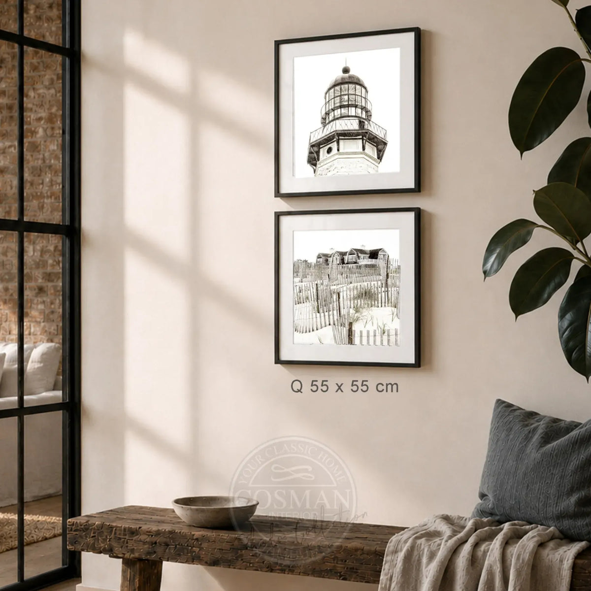
The layout determines whether a group of pictures appears spacious and natural or disjointed and chaotic. For a symmetrical arrangement, choose motifs in similar sizes or formats. This works well above sideboards, beds, and sofas because it echoes the straight lines of the furniture. Two or three framed pictures placed side by side create a clear, sophisticated presence without taking up much wall space.
A free gallery wall is more vibrant. Here, portrait and landscape formats, large and small pictures can coexist. It works particularly well in hallways, on staircases, or on large, open wall surfaces. To prevent this arrangement from looking haphazard, it needs a visual focal point. This could be a large motif in the center or a picture whose color scheme is echoed in several smaller works.
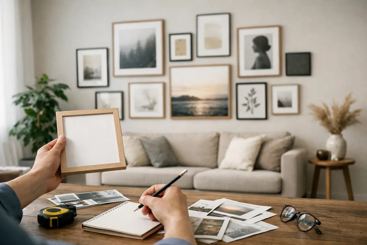
Lay the composition out on the floor before hanging it. For even greater precision, use life-size paper cutouts, which you can attach to the wall with painter's tape. This allows you to see from a normal viewing distance whether the proportions are correct. Move individual pieces around until the outer edges form a harmonious overall shape – for example, a rectangle, a loose square, or a gently rising line along a staircase.
The spacing should be deliberately consistent. Five to eight centimeters between the frames is usually sufficient as a guideline.For very large works, the spacing can be somewhat larger, while for smaller formats a closer grid usually works better. The exact number of grid points is less important than a consistent, logical pattern. Inconsistent spacing can quickly make even high-quality images appear cluttered.
Large formats give the wall presence
A common question is: Should you hang many small pictures or one large one? This depends on the wall and the furniture. On a wide wall above a three- or four-seater sofa, a large piece or a two-part ensemble often has a greater impact than numerous small formats. As a rule of thumb, the entire group of pictures should occupy approximately two-thirds of the width of the furniture below. It doesn't have to be a perfect fit, but it shouldn't look lost or extend beyond the sides of the furniture.
Small pictures are no less valuable, but they need proximity and a clear context. Four to nine different sizes can create an intimate, personal gallery. Choose motifs with recurring tones or a uniform framing scheme. Individual, very small frames scattered across a large wall, on the other hand, usually lose their impact.
Frame as a unifying design element
The frame is more than just protection for the print. It determines whether an image appears modern, classic, coastal, or graphic. Black frames give definition to architectural, black-and-white photography, and high-contrast images. Oak or light wood tones bring warmth to Scandinavian-inspired, natural interiors. White frames make light images appear particularly airy, while darker woods or black frames create a strong, elegant contrast to light walls.
For a harmonious gallery wall, a uniform frame is the simplest solution, especially if the artwork is diverse. Those seeking more depth can combine two related finishes, such as black and dark wood. In this case, the combination should be consistently repeated rather than being chosen anew for each picture. Three or more frame colors only work well in very eclectic spaces.
The passe-partout also alters the overall effect. It creates space between the image and the frame, lending a sense of calm, especially to smaller subjects. With detailed photographs, delicate coastal scenes, or minimalist abstractions, this white space can create a particularly elegant effect. For very large, intensely colored images, it's not always necessary – here, the subject matter can directly occupy the space.
High-quality photo paper, a neatly crafted frame, and acrylic glass ensure that the gallery wall doesn't look like a temporary solution. Especially when several pieces are displayed together, differences in materials are immediately noticeable. Ready-to-hang framed wall art not only saves time but also provides a solid foundation for the entire composition right from the start.
The right height: Don't hang it too high.
The most common mistake with gallery walls is hanging them too high. Pictures are often hung facing the upper half of the wall, even though they should be aligned with furniture, doors, and the eye level of the people in the room. As a starting point, the center of the picture is often about 145 to 155 centimeters above the floor. In living areas, it can be positioned slightly lower if there is a sofa or sideboard underneath.
Above a piece of furniture, there should generally be a gap of about 15 to 25 centimeters between its top edge and the bottom frame. This creates a sense of connection without making the pictures appear cramped. For a gallery wall, the focus is not on the center of each individual frame, but rather on the visual center of the entire group.
When arranging frames on stairs, follow the upward slope. Keep the distance to the stair line as constant as possible, rather than aligning the frames horizontally.Good lighting is also crucial in the hallway: grazing light or a small picture light can clearly highlight texture, colors, and framing. Direct sunlight should be avoided as much as possible for valuable prints.
Combining motifs without it becoming arbitrary
Travel motifs lend a gallery wall a particularly personal, yet elegant touch. A photograph from Port of Hamburg can be combined with a clear shot of New York architecture and a tranquil beach view from the Hamptons It works if, for example, blue, beige, or graphic lines are repeated. The goal isn't to include all your favorite places. Fewer motifs with a clear connection to each other appear more sophisticated.
Even with abstract paintings, it's worth considering the existing color palette. Pick up a tone from the room, but avoid an overly precise tone-on-tone solution. A painting can provide contrast: a deep blue with light wood, warm sand tones with cool stone, or a vibrant red as an accent in an otherwise neutral setting. Wall art should not only confirm the room's existing colors but also give it character.
When mixing photographs and abstract motifs, prioritize one visual language. If the wall consists primarily of tranquil landscapes, an abstract print can serve as a unifying color accent. If it mainly features graphic works, the photography should have a similarly minimalist feel. A dense collage of portraits, quotes, landscapes, and various styles is possible, but requires a deliberately maximalist interior. For most living spaces, a carefully curated selection is the more enduring choice.
From planning to the ready-to-hang wall
Measure the wall width and the furniture beneath it before choosing formats. Photograph your paper sample from a few meters away – unevenness and irregular spacing are often more noticeable on a mobile phone. Only mark the hanging points once you are satisfied with the layout. Use a spirit level for straight rows and, when hanging multiple frames, always check the spacing, not just the height.
Cosman Photocollection prints images on high-quality photographic paper, frames them by hand, and delivers them with hanging hardware. This makes installation particularly easy for larger gallery walls: format, frame, and ready-to-mount presentation are all coordinated, instead of having to be pieced together from various sources.
A gallery wall doesn't have to be the final version the first time around. It can evolve with the room, as long as its core concept remains. Start with the pictures you truly want to display, give them ample space, and choose a frame that will complement your decor for years to come. Then, a blank wall won't become a mere decorative addition, but rather the part of the room that naturally draws the eye.