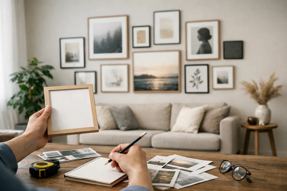
Gallery wall planning: design rooms stylishly
An empty wall above the sofa, in the hallway, or at the dining table rarely looks truly empty – it's waiting for a decision. With a well-thought-out design... Gallery wall planning Individual images are transformed into a striking focal point, giving the room personality, depth, and a distinct atmosphere. The key is not to cram in as many motifs as possible, but rather to choose formats, frames, and spacing so that everything blends together seamlessly.
A gallery wall can evoke memories of travel, bring urban energy into a living room, or add a graphic touch to a tranquil interior. Whether it's a view of Hamburg, the dunes of Sylt, sunny scenes from California, or abstract motifs – it's the combination of these images that transforms them into a personal wall design.
Gallery wall planning begins with the wall.
Before selecting artwork, consider the space and its surroundings. A gallery wall above a wide sofa or sideboard can appear spacious. Ideally, its total width should cover approximately two-thirds to three-quarters of the furniture. This creates a connection without the pictures looking lost or the wall feeling cluttered.
Different rules apply in hallways, above staircases, or next to doors. Narrow wall surfaces benefit from a vertical arrangement, for example, with two or three portrait-format works stacked one above the other. On a stairwell wall, the hanging can follow the ascending line. It's important that the centers of the images create a visually smooth flow and don't change abruptly at each step.
Viewing height is also important. As a guideline, the center of a single artwork should be around 145 to 155 centimeters above the floor. When viewing a group of pictures, consider the entire composition as a single object: your imaginary center should be at eye level. Above a sofa or bed, the hanging can start slightly lower so that the artwork remains close to the furniture. A distance of about 15 to 25 centimeters from the backrest or headboard usually looks harmonious.
The right concept for your gallery wall
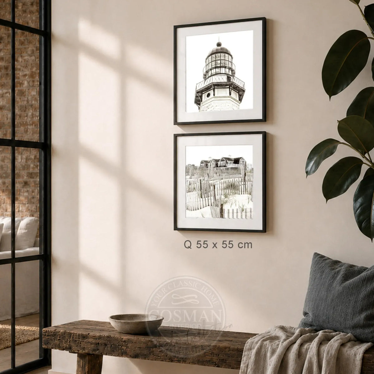
The best arrangement depends on the room, the interior design style, and the subject matter. Those who appreciate calm and symmetry often opt for a grid. Frames of the same size are hung at identical intervals in a clear row or rectangle. This option works particularly well in modern living spaces, workspaces, and long hallways. Architectural photographs, black-and-white photography, or a series of related travel motifs appear precise and sophisticated within this grid.
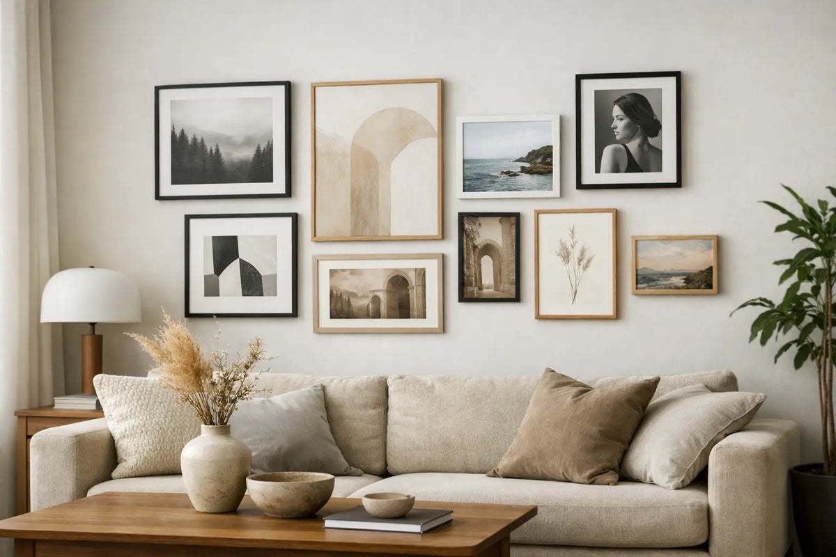
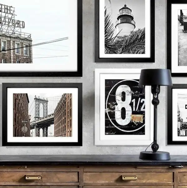
The salon style is somewhat more relaxed. Here, different formats come together, but a unifying element holds the group together: a similar color palette, recurring frame colors, or a common theme. For example, coastal scenes from the Hamptons and Saint-Tropez can be combined with light, sandy hues. Cityscapes of New York or Hamburg They gain graphic presence in black or dark frames.
For smaller walls, a group of three is often the most effective solution. Three equally sized portrait or landscape formats create a clear statement without appearing haphazardly decorative. On a large, empty wall, however, a composition of five, seven, or nine pictures is appropriate. More images, however, require more discipline: not every favorite picture needs to be on the same wall.
A theme creates atmosphere
A common theme greatly reduces the complexity of the planning. This could be a place, such as the Elbe River, Sylt, or Florida. It could also be a mood: sunny and light, urban and contrasting, calm and connected to nature. Even abstract prints can be convincingly integrated if the colors or lines correspond with each other.
Observe the effect from a few steps away.If the images look beautiful individually but appear restless as a group, this is often due to too many different colors or a lack of balance. A large main motif can provide stability to the composition. Smaller works complement it, rather than competing with it.
Consciously combine formats and proportions
Large formats not only appear larger, they also create a sense of calm. A single 70 x 100 centimeter picture above a sideboard can have a more impactful effect than six smaller frames. This is particularly useful when furniture, rugs, or curtains already provide a lot of structure to the room.
Multi-panel gallery walls, on the other hand, thrive on interplay. For example, combine a large horizontal format with two smaller vertical ones, or place a medium-sized picture as the center and frame it on the sides. An imaginary outer edge helps here: Arrange the frames so that their outer edges roughly form a rectangle or a clear stepped shape. The arrangement then appears free, but not random.
The spacing between frames is more important than many people realize. Five to eight centimeters usually works very well. In a strict grid, four centimeters is also acceptable, while larger-format works need a little more space. Varying spacing can quickly make a wall look cluttered. Therefore, don't wait until you're hanging the artwork to measure; measure consistently right from the planning stage.
Frames are part of the overall picture
A frame not only protects the print, it defines its character. Black frames emphasize contrasts and suit clean, urban interiors. White frames appear light and understated, especially on colored walls or in bright rooms. Natural wood brings warmth to Scandinavian-inspired interiors, while dark woods add classic or elegant touches.
A uniform frame color is the safest choice when different motifs are combined. Those who want to deliberately mix and match should limit themselves to two materials or color tones. This keeps the wall curated. Also, the Frame depth and passe-partout The frame's appearance is influenced by several factors: A generous white passe-partout gives smaller images more space and makes photographs appear particularly elegant. For very large, color-intensive images, a more minimalist frame might be the better choice.
First on the floor, then on the wall
The simplest step prevents most mistakes: First, lay all the framed pictures out on the floor. Use a free space where you can roughly recreate the future wall layout. Move the frames around until the sizes, colors, and viewing angles are balanced. Take a photo of the final arrangement with your smartphone before you begin.
Alternatively, cut paper to the appropriate frame sizes and attach it to the wall with residue-free adhesive tape. This is particularly helpful for large groups or difficult wall surfaces. You can immediately see if the gallery is hanging too high, if there is enough distance to lamps and furniture, and where its focal point lies.
Next, mark the hanging points, not just the frame edges. Keep in mind that the mounting point on the back of a frame may be slightly lower than its top edge. A spirit level ensures precision when hanging pictures in rows and grids. It's also useful for a deliberately asymmetrical gallery wall to prevent individual pictures from appearing unintentionally crooked.
Quality that becomes visible on the wall
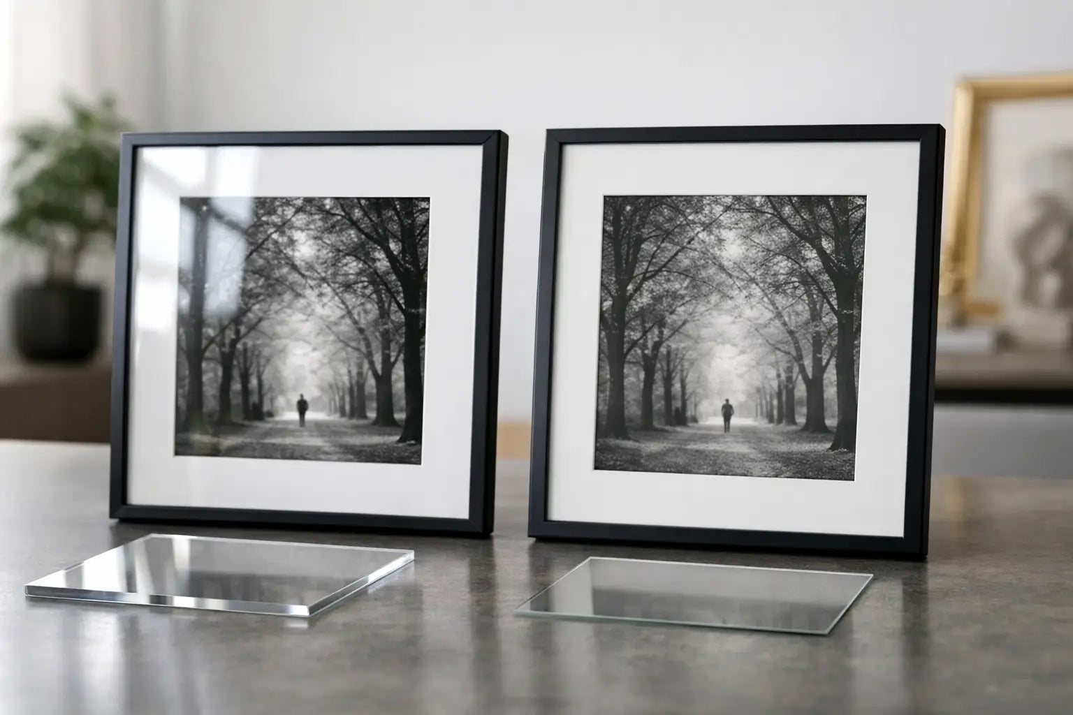
On a gallery wall, every detail is more noticeable than on a single poster. Different paper qualities, loose edges, or inconsistent frames can quickly make even good images appear less valuable.High-quality photo paper, neatly finished frames and a protective acrylic glass give the composition the calm, professional look it deserves.
It's especially convenient when artworks arrive ready to hang. At Cosman Photocollection, prints are produced on high-quality photo paper, hand-framed, and come with hanging hardware. This simplifies the process, particularly when coordinating multiple sizes. Instead of organizing printing, framing, and mounting separately, you can focus on what truly determines the impact in the room: selection and placement.
Common mistakes in gallery wall planning
The most common mistake is placing too few pictures on a large wall. If the pictures have a lot of empty space around them, they often appear hesitant rather than deliberately placed. In this case, a larger format, an additional row, or a more generous passe-partout can help—not necessarily more decoration in the room.
Equally problematic is hanging pictures that start too high. Pictures should be connected to the furniture and the people in the room, not hover just below the ceiling. Always check the height from your usual sitting or standing perspective.
Too many styles can also disrupt the desired sense of calm. A maritime coastal scene, a vibrant pop art graphic, and a classic floral still life can work together, but then they need a clear unifying element in terms of color, frames, or sizes. If this unifying element is missing, it's often more elegant to plan a second, smaller gallery wall elsewhere.
A successful gallery wall doesn't have to be perfectly symmetrical. It should simply look as if every decision was made deliberately. Take the time to move artwork around on the floor, check distances, and consider the wall as a whole. Then, a blank space will become a place where your home tells its own story.