Decorating and enhancing your living room with travel photos
Decorating a living room with travel photos doesn't mean randomly throwing memories on the wall. Well-chosen photographic art gives the room direction: the expansive horizon of Sylt, the warm light of Florida, the clean lines of New York's architecture, or a tranquil beach moment from the Hamptons. This creates an interior that feels personal while maintaining the serenity of a well-thought-out overall concept.
Travel photography works particularly well in the living room because it visually opens up spaces. A coastal scene creates a sense of vastness, while an urban image provides a striking contrast to soft textiles and natural materials. The specific destination is less important than the effect you desire in your everyday life: relaxed, sophisticated, vibrant, or serene.
Create a desired mood with travel photos
Before choosing a motif, it's worth taking a look at the room itself. A bright living room with linen, oak, and muted colors often benefits from photographs featuring sand, water, and open skies. Motifs from Saint-Tropez, California, or Sylt capture this lightness without appearing decoratively cluttered. They introduce color but remain within a natural, homely palette.
In more modern living spaces with dark furniture, metal, or clean lines, the images can be more graphic. Architecture, street scenes, or a striking view of Manhattan add energy to a minimalist interior. Black-and-white cityscapes look particularly sophisticated when the room already contains many materials and colors. They create a focal point without competing with the sofa, rug, or lighting.
For a living room intended more as a retreat, tranquil compositions are the better choice. A single beach scene, a gentle coastline, or a photograph with a lot of sky allows the wall to breathe. This principle can be more effective above a deep sofa or a wide sideboard than a densely packed wall of pictures.
Decorating your living room with travel photos: The right format
Size determines whether a picture has presence or gets lost on the wall. Above a sofa, a single piece of wall art should generally be significantly wider than a small, individual motif. As a guideline, the artwork can occupy approximately two-thirds of the sofa's width. For a 240-centimeter-wide sofa, a format between approximately 140 and 180 centimeters usually looks harmonious – depending on the wall height, furniture, and the image's composition.
Large-format travel photography particularly showcases landscapes. The sea, a wide promenade, or the horizon line are given space instead of appearing as a small detail. A large picture can also soften a challenging wall: for example, behind a sofa, in an open-plan living and dining area, or opposite large windows.
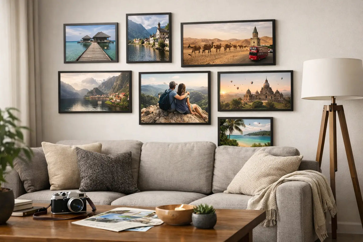
Smaller formats are most effective when grouped together. Two or three images with a similar color palette create an elegant sequence, for example, a coastline, a pool, and architecture from the same destination. A unifying element is crucial: the same frame color, identical dimensions, or a recurring hue. Without this common thread, a combination can quickly appear random.
The orientation also influences the overall impression. Horizontal formats emphasize the character of landscapes, beaches, and skylines and are ideal for use above low furniture. Vertical formats draw the eye upwards, which can be very advantageous in older apartments or rooms with high ceilings. A square motif, on the other hand, appears compact and modern, for example, next to an armchair or as part of a small wall arrangement.
A framework that combines interior design and photography
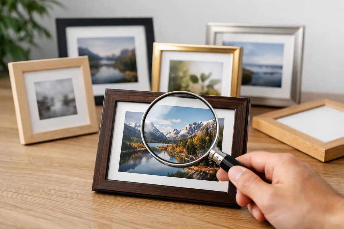
The frame is not merely a detail. It determines whether a travel photo appears as a high-quality piece of furniture or simply as a hung print. A slim black frame precisely showcases cityscapes, high-contrast beach scenes, and graphic motifs. It complements dark accents, modern lighting, and clean-lined furniture.
Light wood frames or warm natural tones harmonize with coastal motifs, light-colored sofas, and organic materials. They don't detract from the photograph's clarity but give the image a softer, more homely feel. A white frame makes colored pictures appear particularly light and is a good choice if the wall itself is already a bold color.
The lighting in the room also plays a role in the decision. Acrylic glass protects the photograph and gives the surface a high-quality finish. However, in very bright living rooms, the picture should be positioned to avoid direct sunlight and strong reflections as much as possible. While a motif can look impressive opposite a window, it is often easier to read in everyday life when placed to the side of the window.
High-quality photo paper, meticulously crafted frames, and precise presentation transform a photograph into a wall art piece that will permanently complement the room. At Cosman Photocollection, the images are printed on premium photo paper, hand-framed, and delivered ready to hang. This simplifies planning, as the print, frame, and hanging hardware are already perfectly coordinated.
The correct placement in the living room
A picture above the sofa shouldn't be hung too high. As a rule of thumb, the center of the picture should be roughly at eye level, slightly lower than in a hallway. A distance of about 15 to 25 centimeters between the edge of the sofa and the bottom of the frame is often considered balanced. This ensures that the furniture and wall art appear to complement each other.
Above a sideboard, the composition can be a bit freer, but should still maintain a connection to the piece of furniture. It looks particularly sophisticated if the artwork corresponds to the sideboard in width or axis. An asymmetrical placement can deliberately create a modern look, but then requires a calm surrounding environment – few objects on the furniture, clean lines, and sufficient free wall space.
In open-plan living spaces, travel photos can help define zones. A large-format print of California can highlight the seating area, while a smaller urban photograph at the dining table adds its own character. Avoid choosing completely contrasting visual styles. A shared frame or a similar color temperature will unify the room.
Personal memories or curated photographic art?
Private vacation photos tell a story, but not every snapshot format is suitable for a prominent living room wall. Different lighting conditions, spontaneous framing, and inconsistent resolutions can quickly make a calm interior look chaotic. Personal photos often find a nice place in a smaller gallery in the hallway, in the study, or in a private corner of the living area.
Curated travel photography is the perfect choice if you want to bring the style of a place into your home without the image feeling too personal or arbitrary. The photography can then serve as a design statement: a reminder of a beloved city, anticipation for your next trip, or simply a visual connection to a feeling, lifestyle.
Both can also be combined. Choose a high-quality framed travel photo for the central wall and complement it discreetly with personal photos on a shelf or in an adjacent room. This way, the living room remains sophisticated without losing its individuality.
Fewer motives, greater impact
The most common mistake with travel photography in the living room isn't choosing the right subject, but having too many. If every free space is filled with a different travel destination, the room loses its sense of calm. Instead, opt for a clear theme: Mediterranean coast, American West Coast, North German beach landscape, or urban metropolis.
Furthermore, be sure to subtly echo the colors from the artwork in the room. A deep blue could be found in a cushion, sandy tones in the rug, a warm rose shade in a vase. An exact color match isn't necessary. Even small repetitions can create a harmonious whole from the photographic artwork and the interior design.
In the end, don't choose a motif that merely reminds you of a place, but rather one that makes you glance at it a little longer when you come home. That's precisely when an empty wall becomes a part of your home's atmosphere.